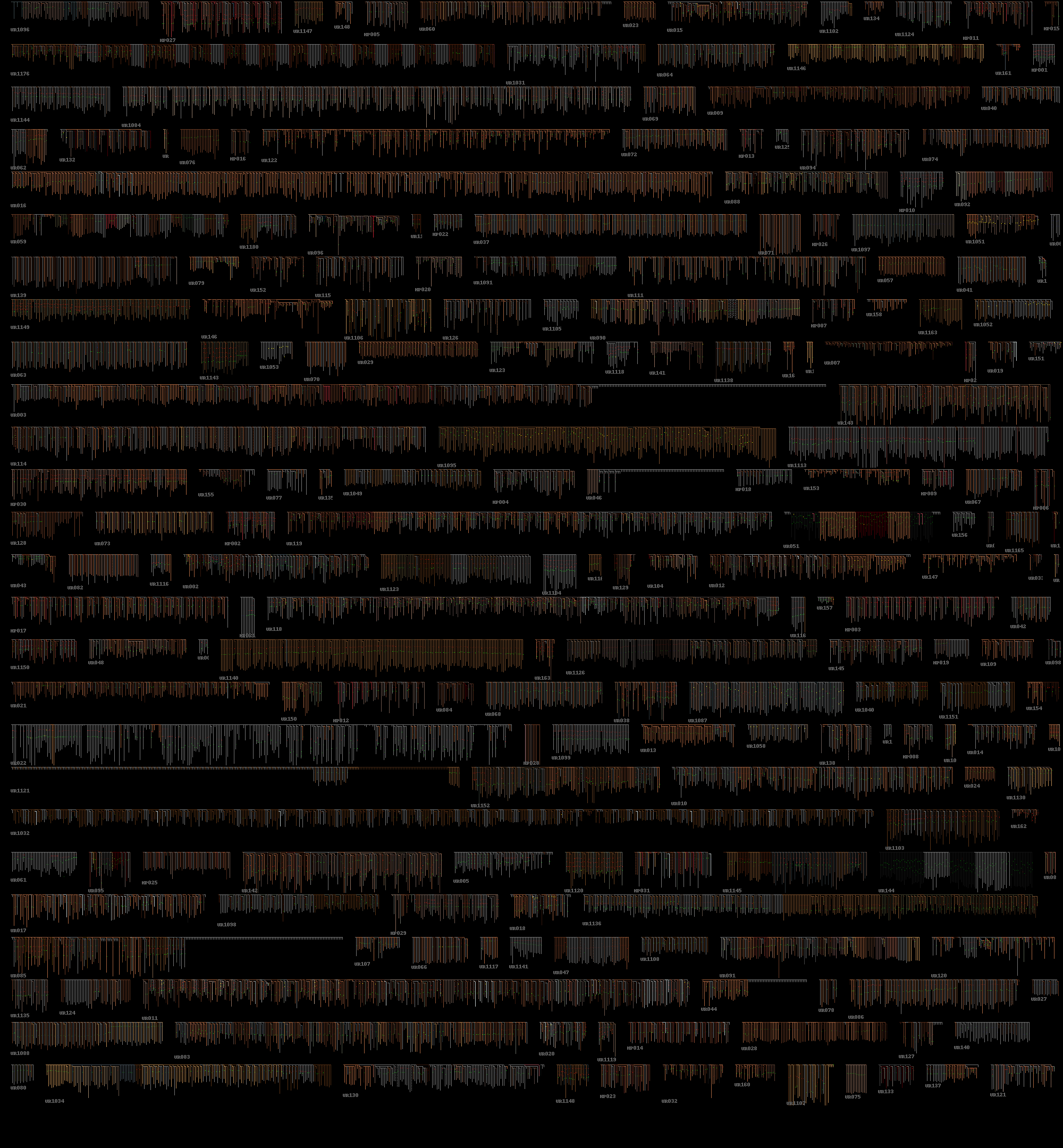
The graphviz visualisations we’ve been using for quipu have quite a few limitations, as they tend to make very large images, and there is limited control over how they are drawn. It would be better to be able to have more of an overview of the data, also rendering the knots in the right positions with the pendants being the right length.
Meet the pixelquipu!
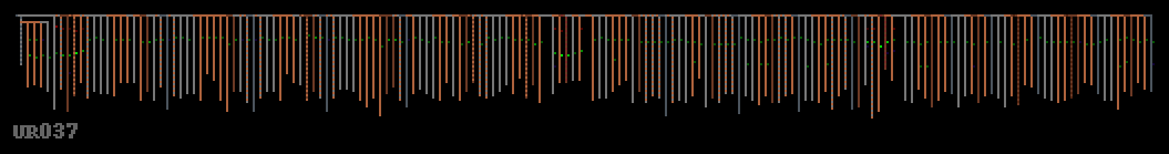
These are drawn using a python script which reads the Harvard Quipu Database spreadsheet file and renders quipu structure using the correct colours. The knots are shown as a single pixel attached to the pendant, with a colour code of red as single knot, green for a long knot and blue as a figure of eight knot (yellow is unknown or missing). The value of the knot sets the brightness of the pixel. The colour variations for the pendants are working, but no difference between twisted and alternating colours, also no twist direction is visualised yet.
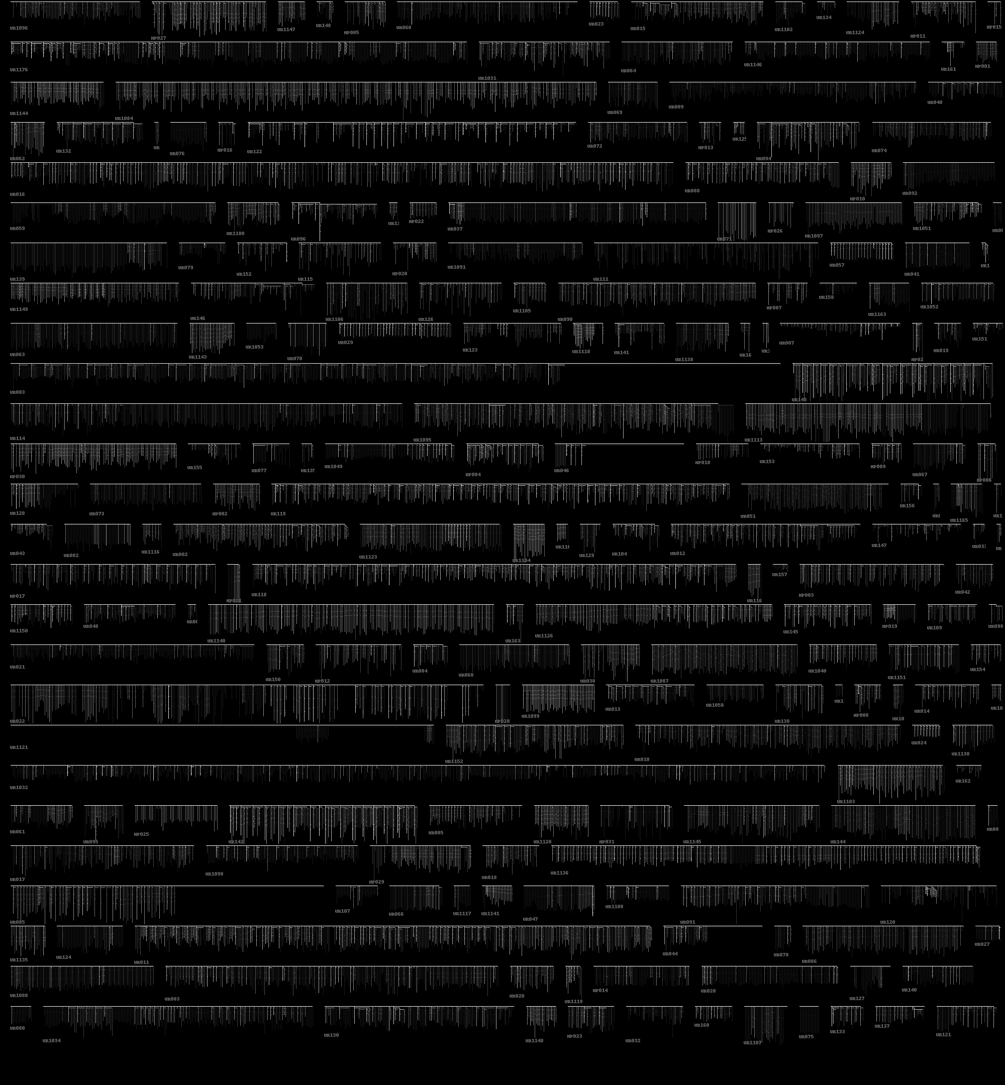
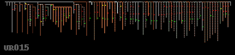
Another advantage of this form of rendering is that we can draw data entropy within the quipu in order to provide a different view of how the data is structured, as a attempt to uncover hidden complexity. This is done hierarchically so a pendant’s entropy is that of it’s data plus all it’s sub-pendants, which seemed most appropriate given the non-linear form that the data takes.
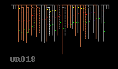
We can now look at some quipus in more detail – what was the purpose of the red and grey striped pendants in the quipu below? They contain no knots, are they markers of some kind? This also seems to be a quipu where the knots do not follow the decimal coding pattern that we understand, they are mostly long knots of various values.
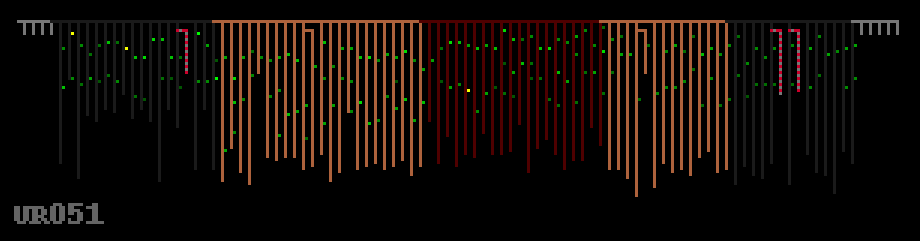
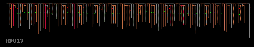
There also seems to be data stored in different kinds of structure in the same quipu – the collection of sub-pendants below in the left side presumably group data in a more hierarchical manner than the right side, which seems much more linear – and also a colour change emphasises this.
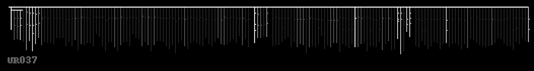
Read left to right, this long quipu below seems very much like you’d expect binary data to look – some kind of header information or preamble, followed by a repeating structure with local variation. The twelve groups of eight grey pendants seem redundant – were these meant to be filled in later? Did they represent something important without containing any knots? We will probably never know.

The original thinking of the pixelquipu was to attempt to fit all the quipus on a single page for viewing, as it represents them with the absolute minimum pixels required. Here are both pendant colour and entropy shown for all 247 quipu we have the data for: